Overview | Discuss
Haiku Hands approached the University of Melbourne in seeking ideas for a new brand identity and collateral for their Dance Compilation album. We were tasked with analysing and developing creative concepts from the provided style materials.

Haiku Hands is a band and art collective primarily based in Melbourne and Sydney. ‘Haiku’ represents their “lyrical interests, distilled ideas and imagery” and ‘hands’ is "the collaborative nature of our projects”. They utilise lighthearted, addictive, spunky and varied beats.
I drew from Haiku Hands’ artistic approach for this brief, and I approached this by researching other contemporary bands that shared a similar style to Haiku Hands.
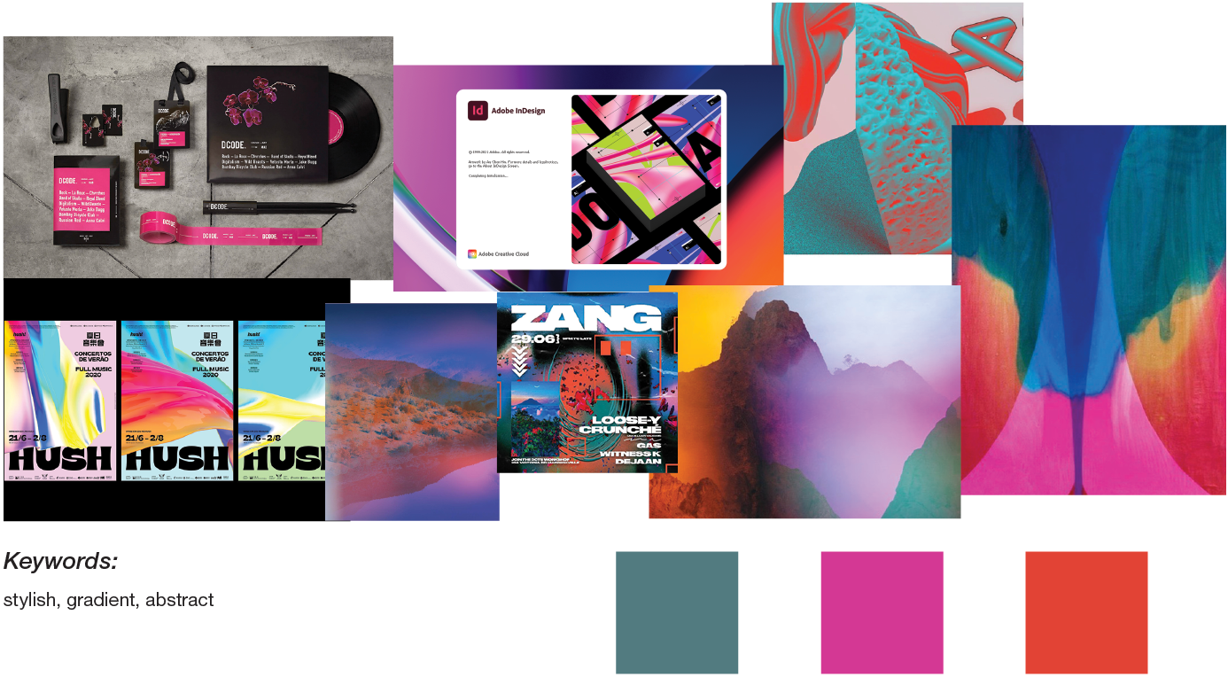
Stylescape
Approach | Do
In the initial stages of development, one concept was centred on a literal representation of hands, with the idea that such a logo would be replicable by audience members, breaking down the barriers between Haiku Hands and their fans. Later stages of development focused on a more typographical/street art style of identity.
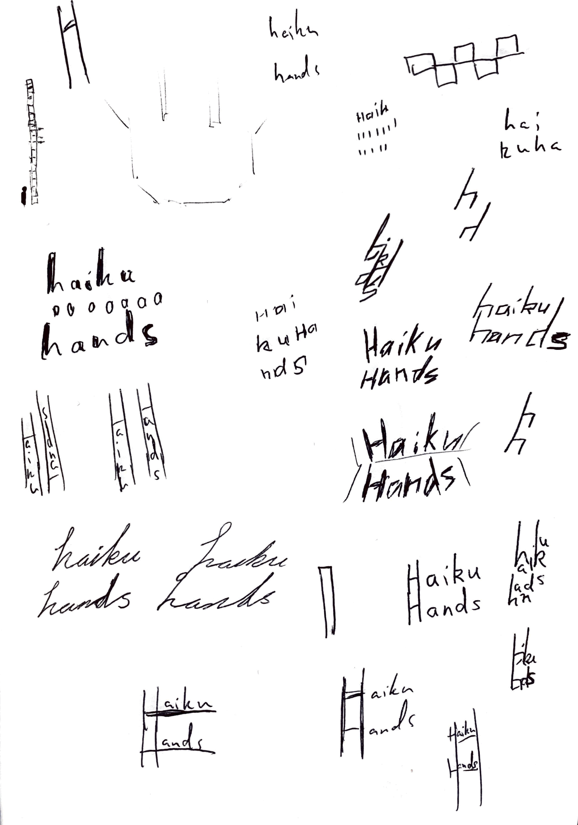
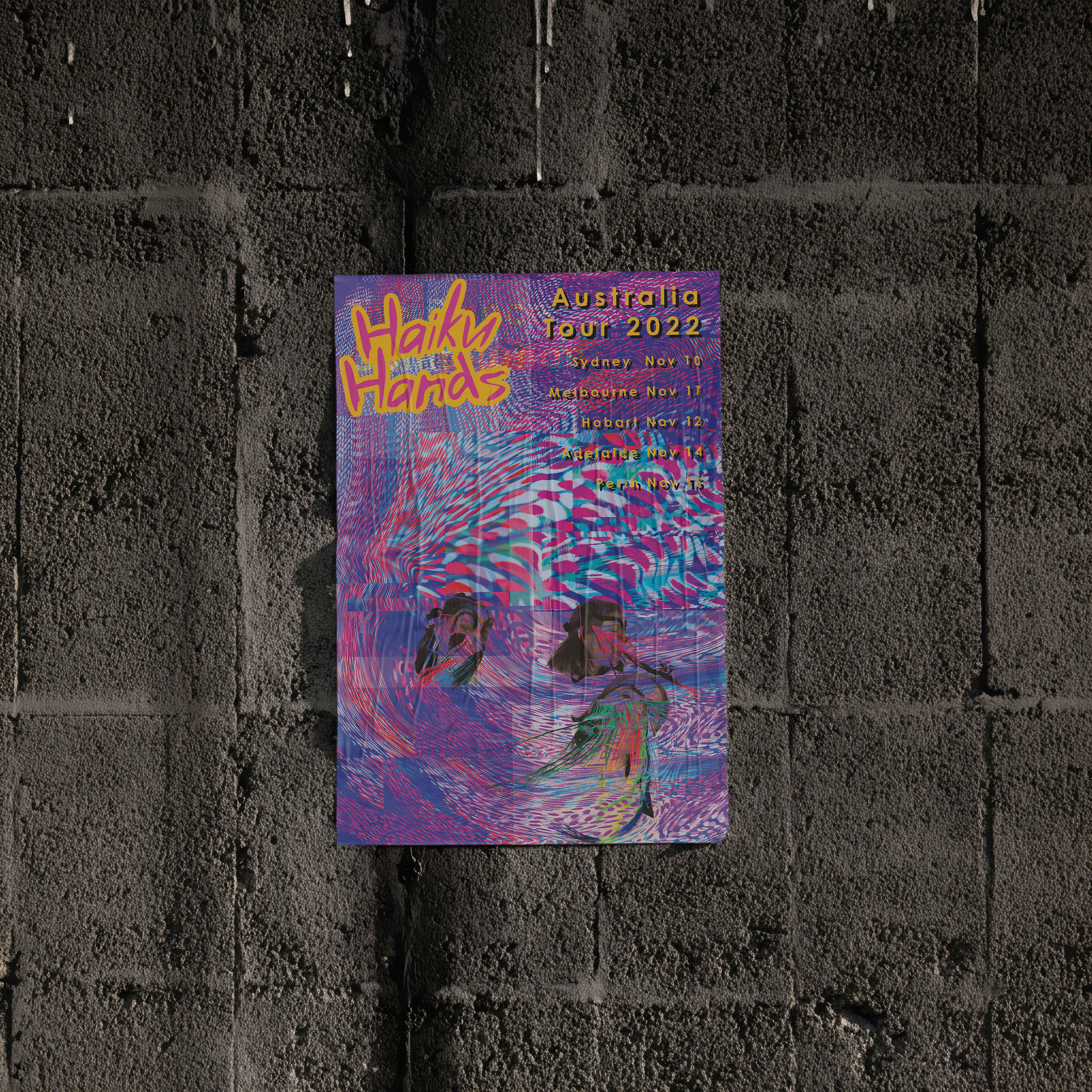
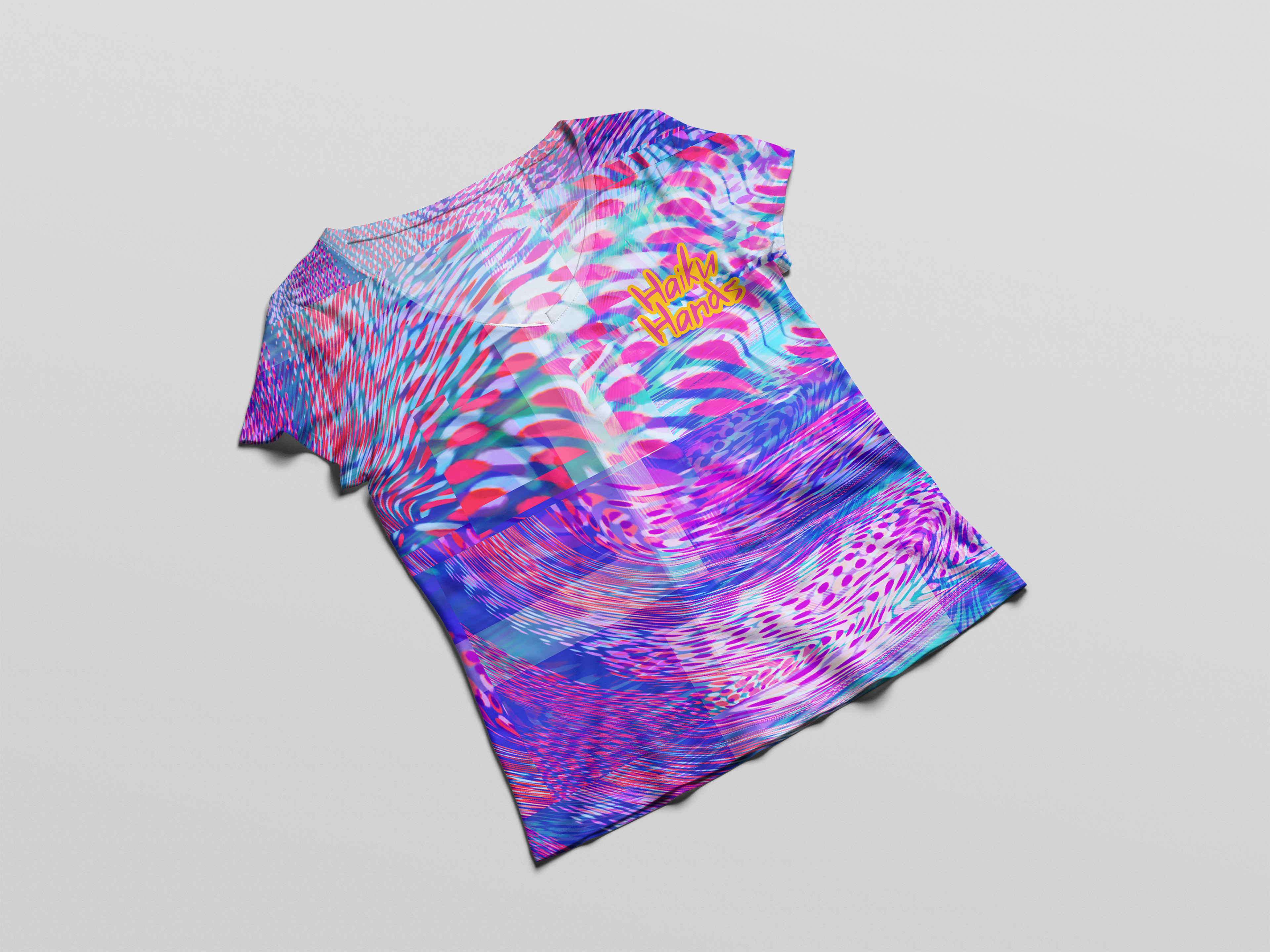
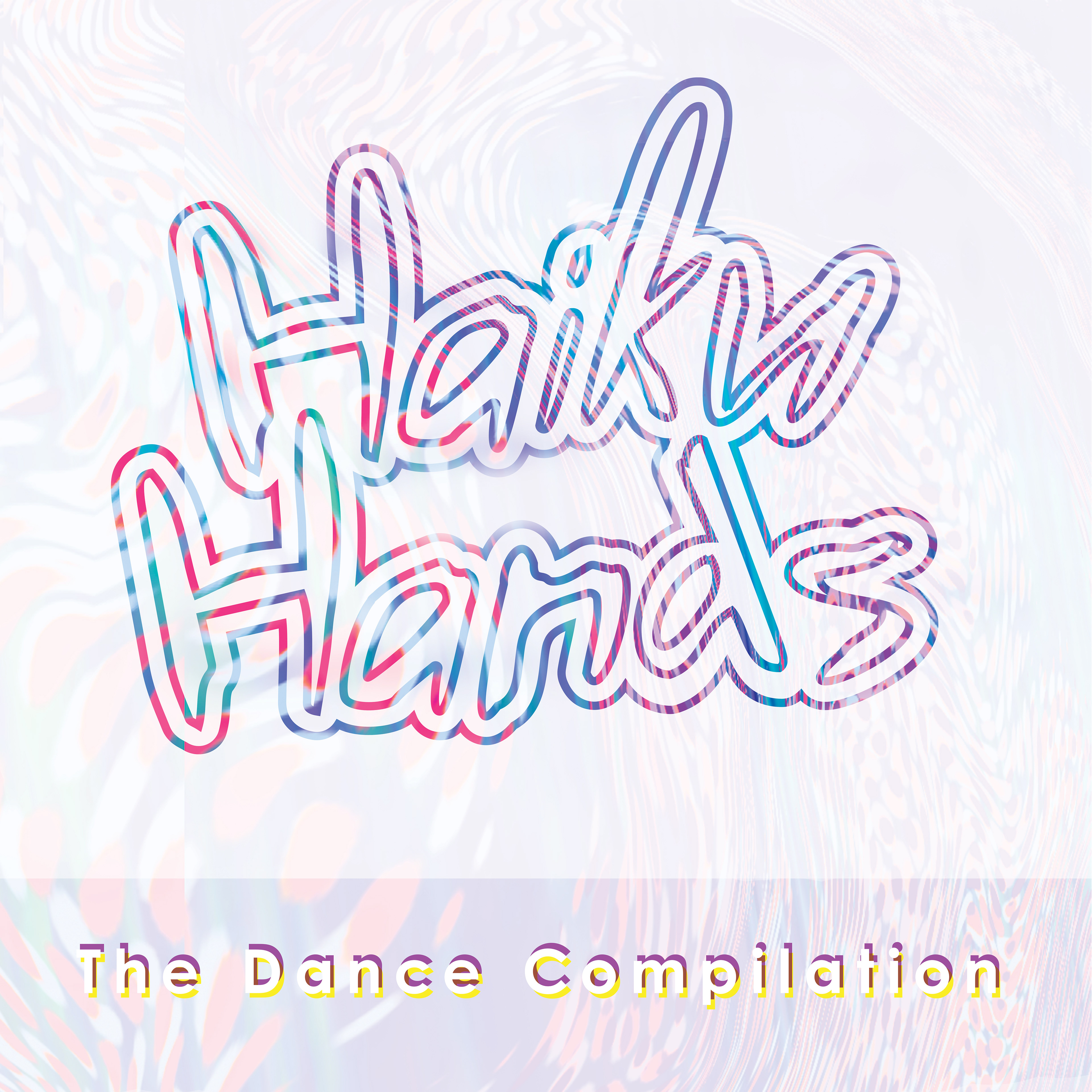
The logo was developed following research of the band’s style and ethos: it is deliberately loose in style and evokes the free spirit exhibited in their music and fashion. It is evocative of graffiti and counter-culture, and the colours have been drawn from elements provided by the band. The magenta is designed to catch the eye, and the golden yellow contrasts and frames this.
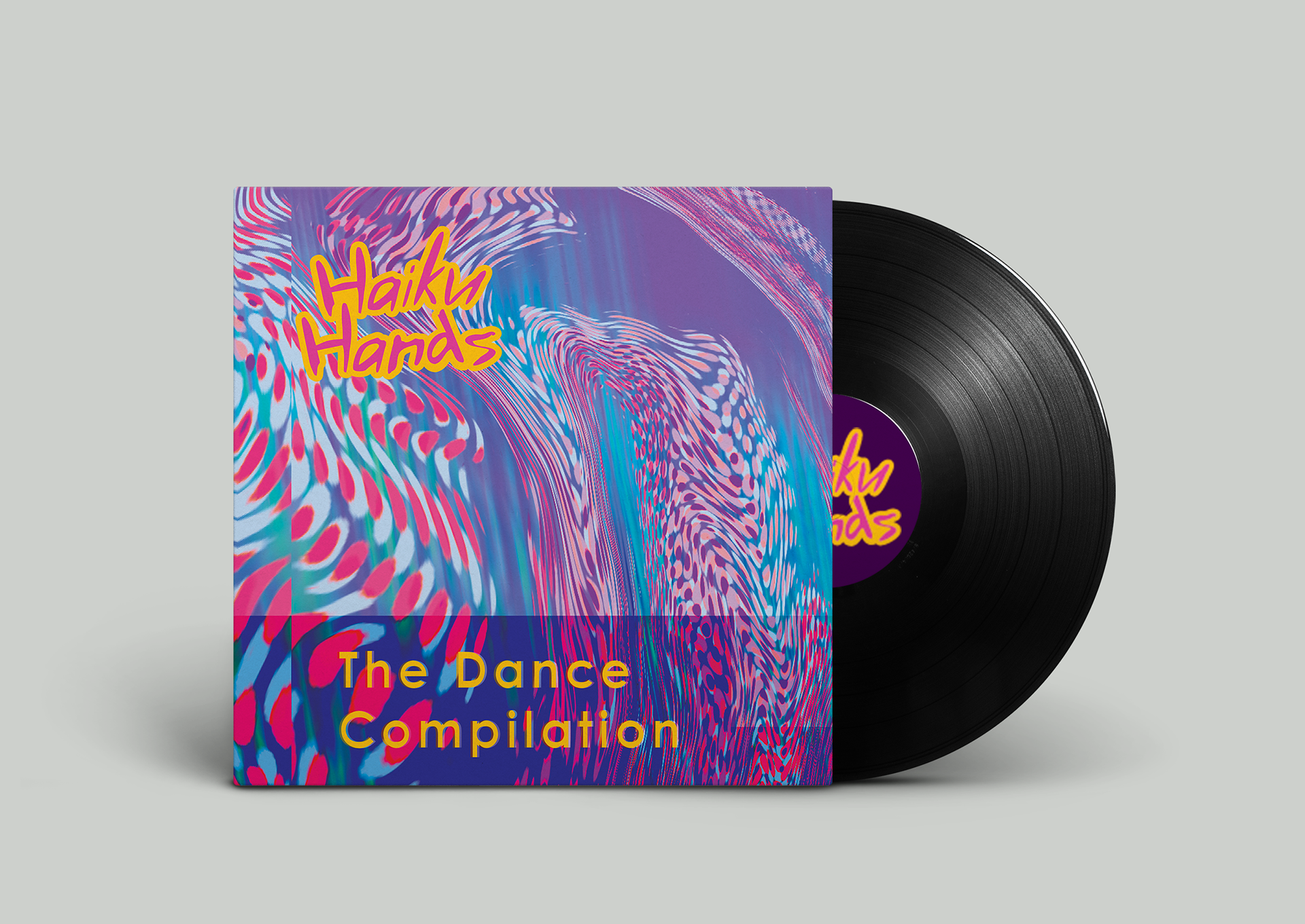
Special edition vinyl
Standard edition CD
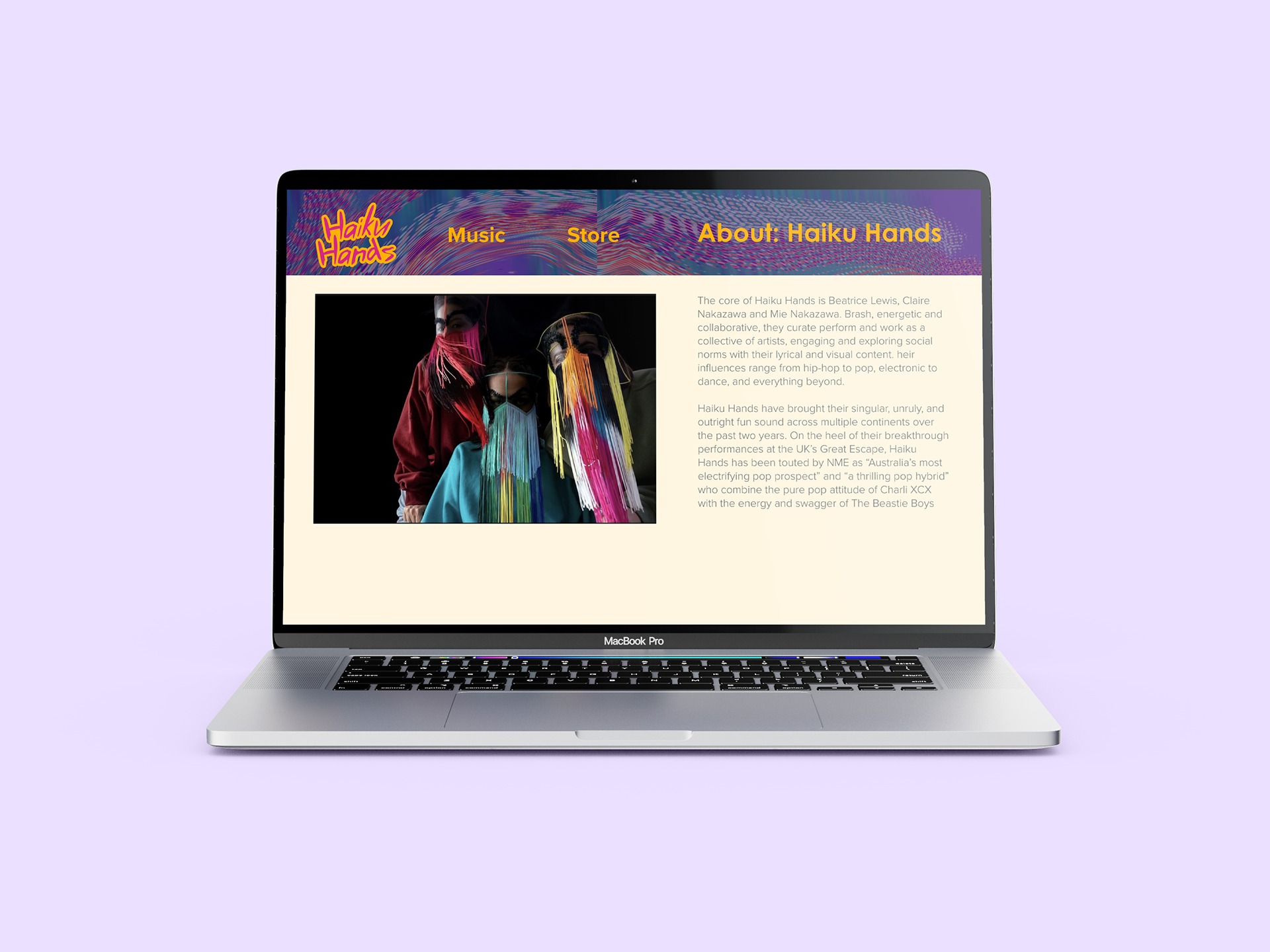
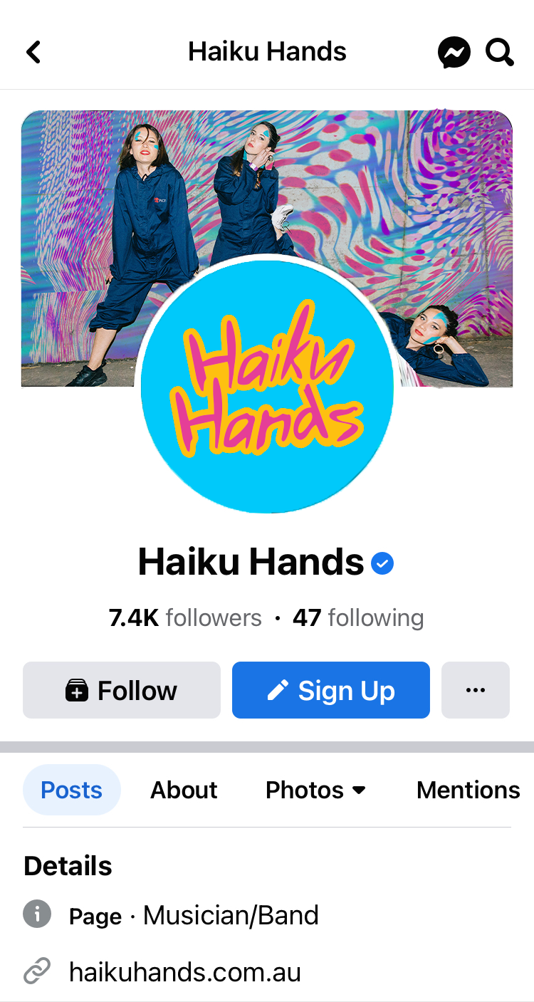
Outcome | Deliver
The identity was applied across posters, social media graphics and event communications, creating a consistent visual presence that supported promotion and audience engagement.