Challenge
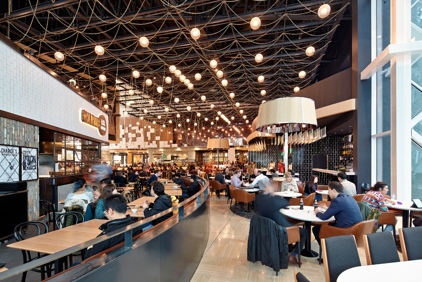
I aimed to breathe new life into Emporium Melbourne's identity, providing it with a unique and fresh perspective. After conducting extensive research, I discovered opportunities to incorporate aspects of the building's structure into the identity, further linking the space and the brand together.
Current Logo
Approach
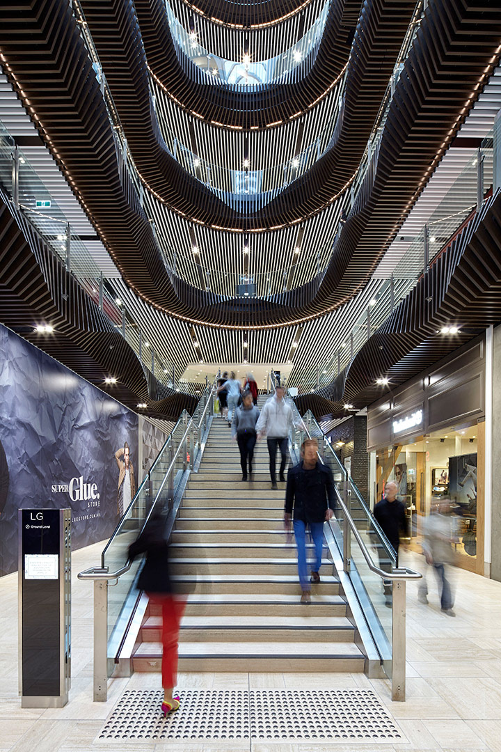
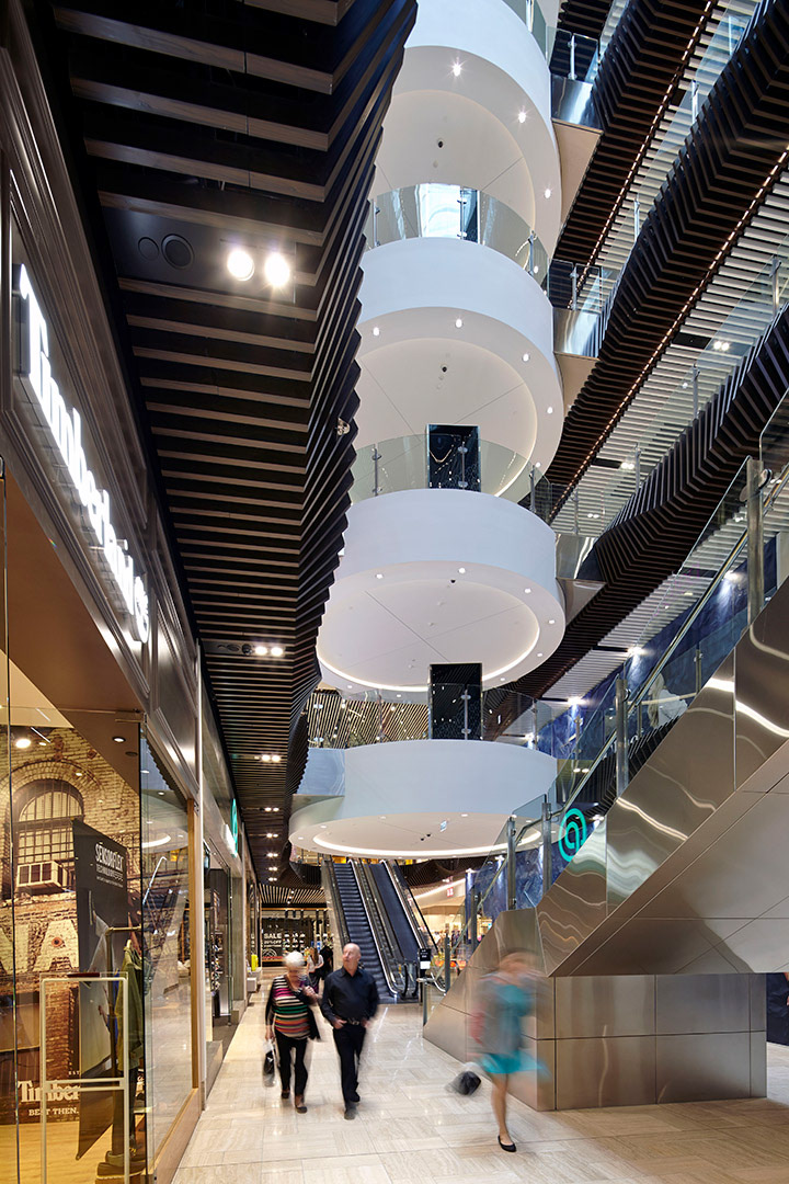
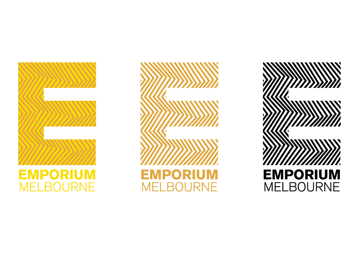
To create the new logo, I explored various options while considering the existing brand identity and the venue. My concept development focused on integrating patterns inspired by the angular wooden panels that serve as support structures and are prominently featured in the building's architecture.
To create the new logo, I explored various options while considering the existing brand identity and the venue. My concept development focused on integrating patterns inspired by the angular wooden panels that serve as support structures and are prominently featured in the building's architecture.
I undertook research on graphic styles and competitors within the retail centre space.
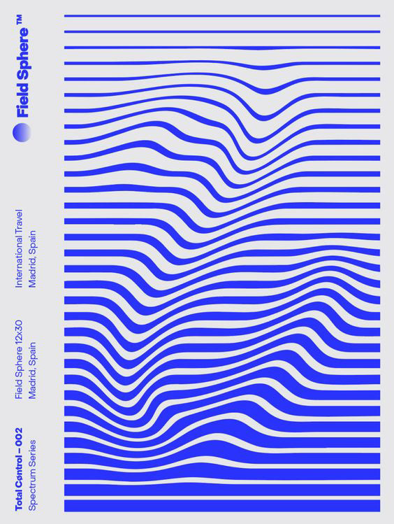


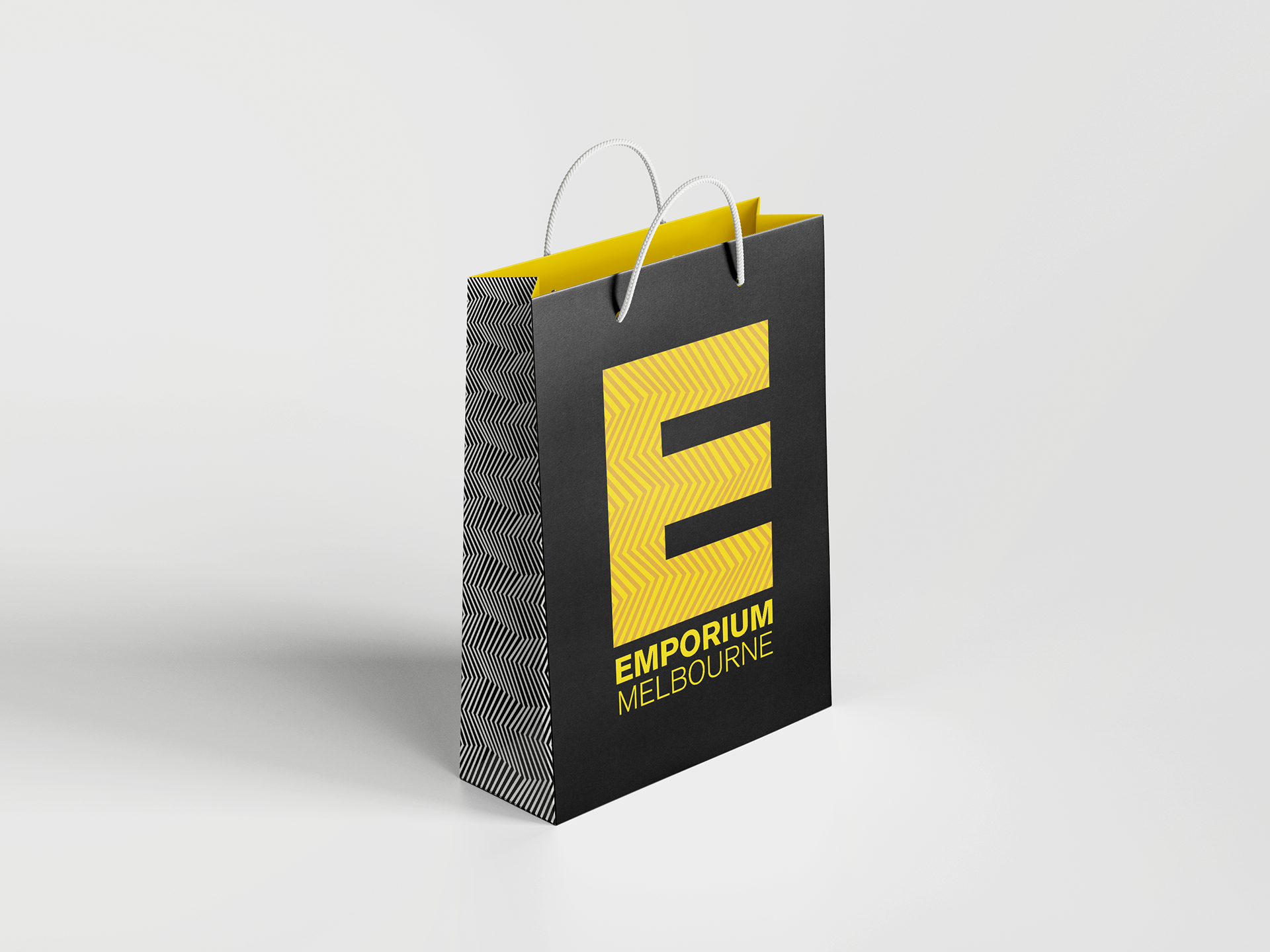
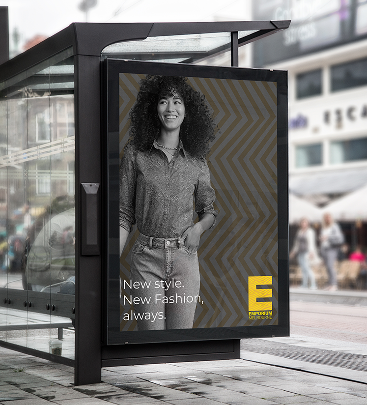
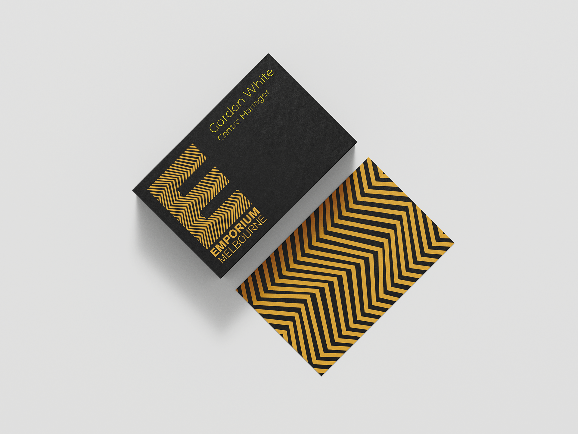
The essence of the new identity emphasises the architectural elements within Emporium Melbourne. The environment incorporates a wavy wooden pattern that gives the impression of movement, reflecting the brand's fashion-forward approach.

Outcome
The essence of the new identity emphasises the architectural elements within Emporium Melbourne. The environment incorporates a wavy wooden pattern that gives the impression of movement, reflecting the brand’s fashion-forward approach.
The logo was designed with three colour schemes in mind: full colour, single, and black and white. This allows for flexibility across a range of use cases.